


In interior design, colors are continuously used. In paintings, wallpaper, floor coverings, furniture, and decorations. Every year, renowned companies announce the color of the year. It is a reaction to events and developments in society. In this area, two groups have the most influential say, Pantone and Akzo Nobel, who develop Dulux colors.
Color of the year by Pantone
This company from New York is the most important in determining color trends. It was founded in the early 60s and has gradually gained a dominant position in many areas. At the end of 2018, Living Coral was chosen as the color of 2019. It is a muted orange color that has a golden tinge. The model was a coral reefs that represent encouragement, hope, sustainability, and ecology. In today's digital age, it was necessary to find a color that calls for new activities and experiencing moments of joy. So the choice was the fresh and vivid shade of coral.
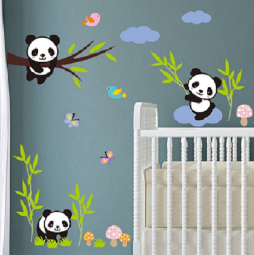
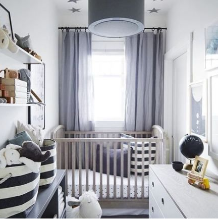
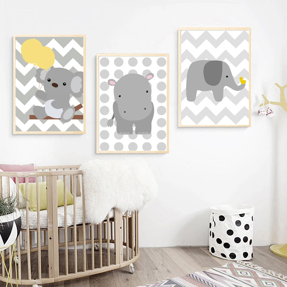
Living Coral in nursery
This shade stimulates the desire for playfulness, making it perfect for children's rooms. This color looks great in a sharp and saturated version. It may be significant or not, depending on the intensity and amount you use. Sometimes you can paint the whole wall. Sometimes you need only a pillow. If you combine it with green, it will look extraordinarily summery and fresh in the room. With earthy tones stick to the ground, and the room will look extremely elegant. The combination with the blue color will look noble, even royal. The gray color blooms and stops being blamed for being boring. We recommend choosing the accessories in golden or brown shades.


Color of the year by Akzo Nobel
Almost everyone knows Dulux paints. That's why Akzo Nobel has an essential say in color selection. For 2019, the aesthetic commission chose color Spiced Honey. It is a warm, neutral color. Perhaps at first glance, you may find it boring and bland. However, in combination with other colors, its beauty remains to be seen. It is intended to create a feeling of coziness, to pleasantly tune a person, to encourage relaxation, and to create a pleasant atmosphere.
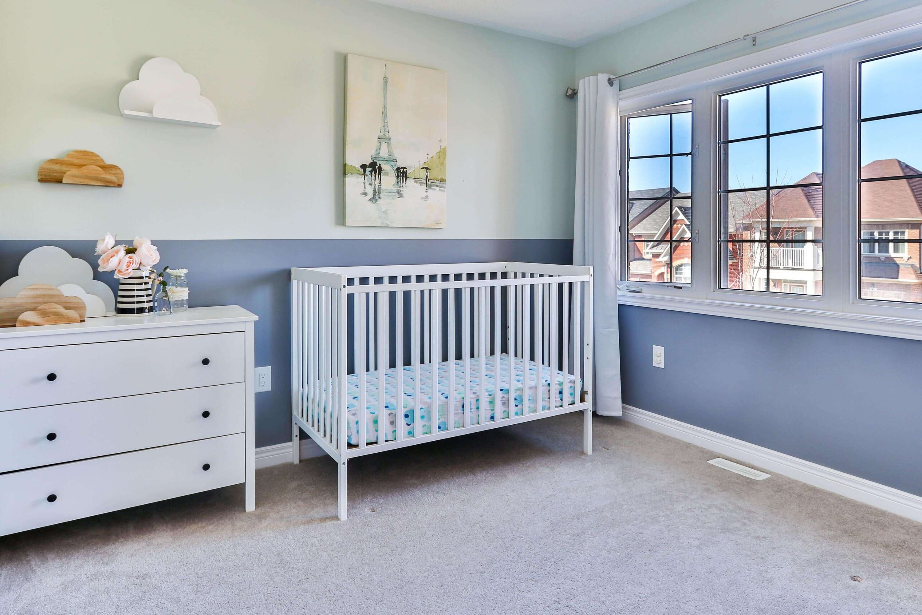
Spiced Honey in nursery
If you choose the color of Spicy Honey, which is less pronounced, it will certainly not be a problem to paint all the walls. Here you can smash the dullness with furniture and accessories in other colors. Since the color is truly versatile, you can combine it with multiple colors. In this case, we recommend choosing white or dark brown furniture. High contrast achieves with dark blue or earthy red and orange.

Both colors are delightful and non-violent. As in many ways, they evoke a return to nature and ecology. They are not blatant and do not appear chaotic. Do not worry about them and embark on the renovation of the interior, whether you go with the times!


Share and get 15% off!
Simply share this product on one of the following social networks and you will unlock 15% off!